The Constant Scribe

Friday
May122017

The Scriptorium is my work journal; a place for show and tell.
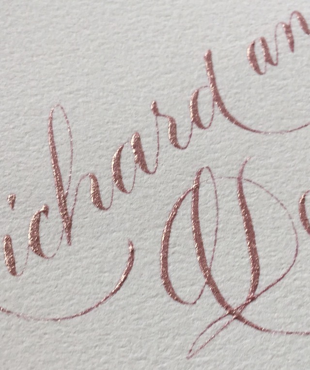
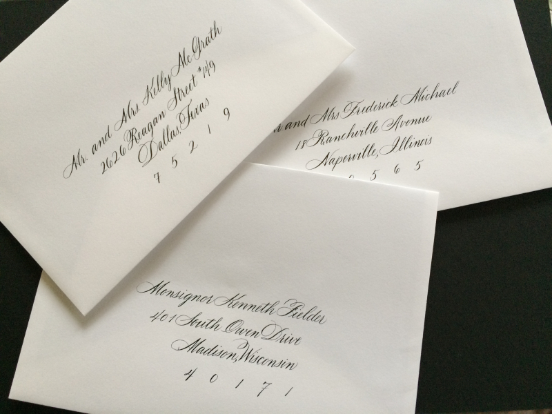
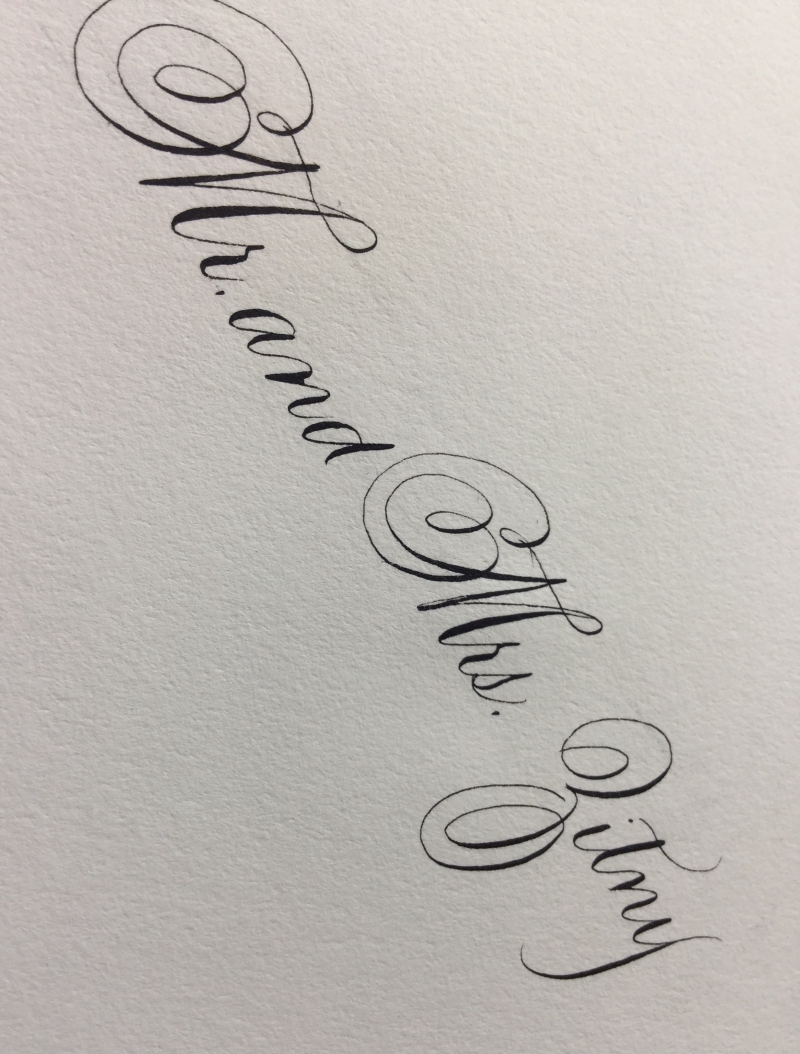
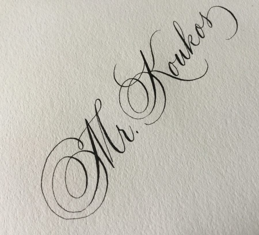
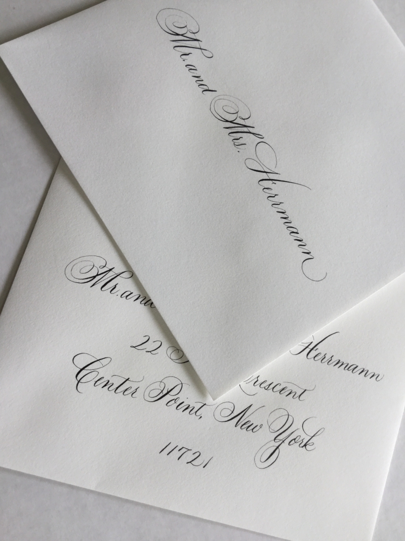
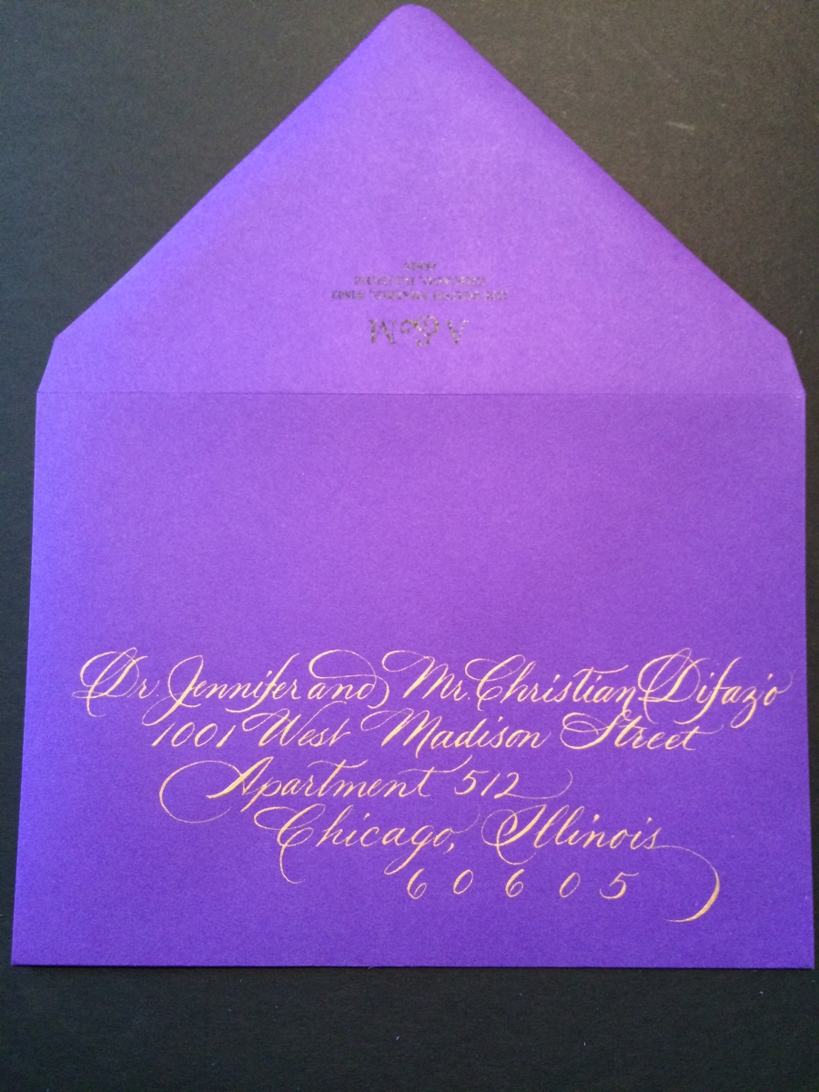
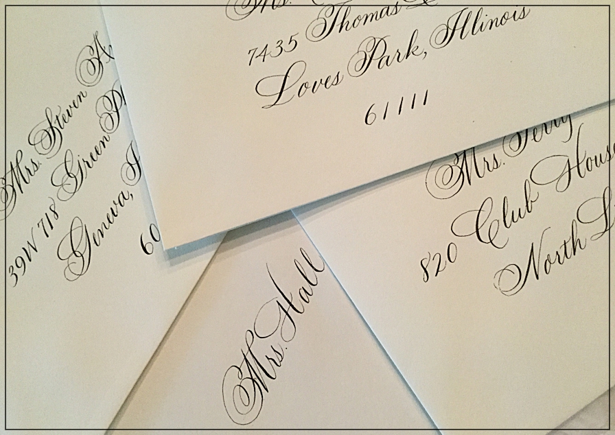
This hand lettered script is based on Poem Script. Poem Script is a stunning Sudtipos font based on an Italian Script that reverses the hairlines (thin strokes) and shades (thick strokes) on some of the capital letters. This presents a particular challenge to calligraphers and requires turning the work upside down in order to execute the reversed shades. Since this would be a daunting task when addressing envelopes, the shades are written in their usual position but the elegant charm remains.
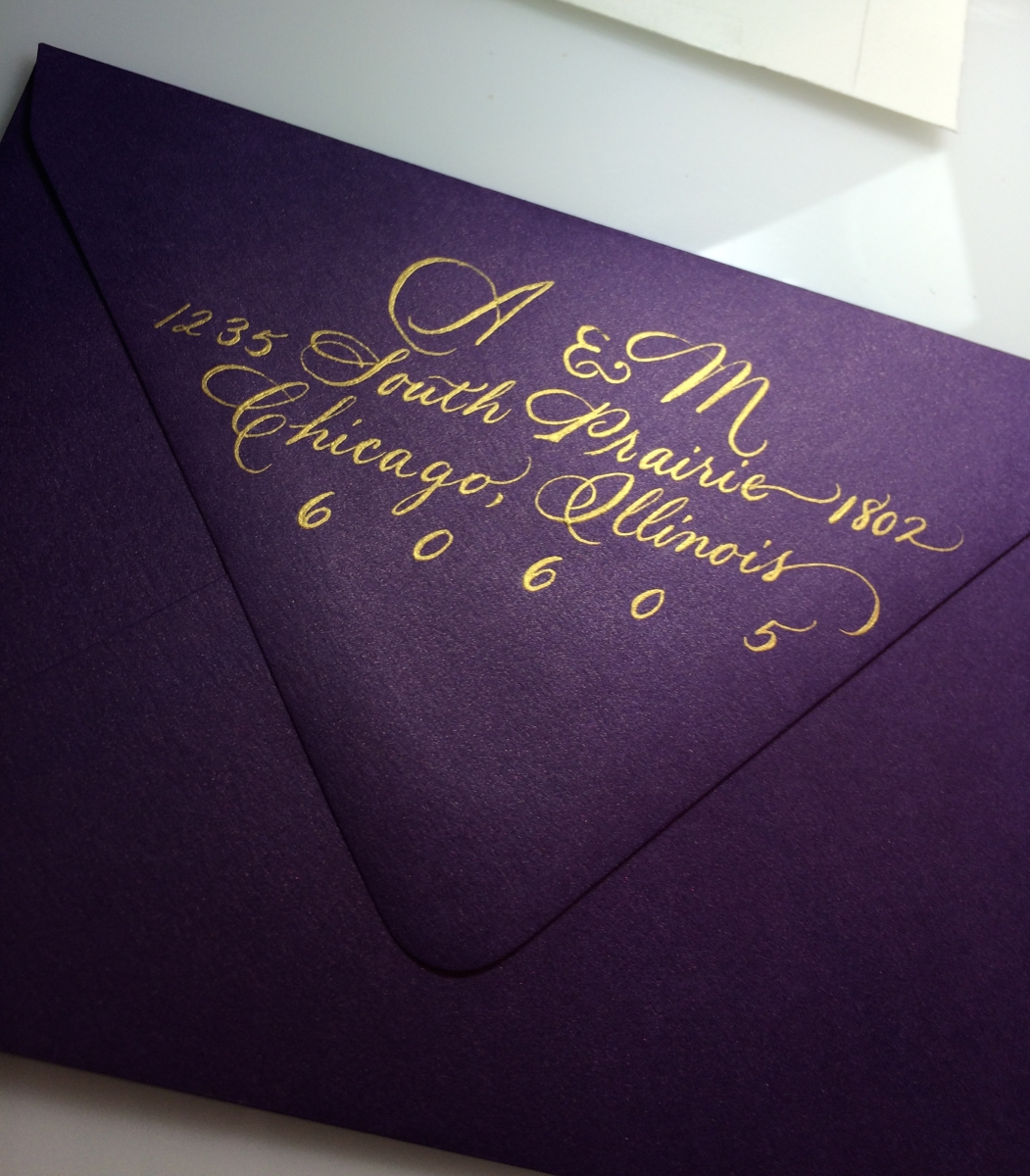
This script took some practice! Before I could begin addressing these double envelopes, I had to do some warm ups. I plugged my earphones into my iPod and cranked up some early Genesis (Selling England by the Pound). As I listened, I wrote out snatches of lyrics. And sang along. Which could have been embarrassing had anyone been around to hear me singing with headphones on. . .
Next, it was time to mix the navy blue gouache.
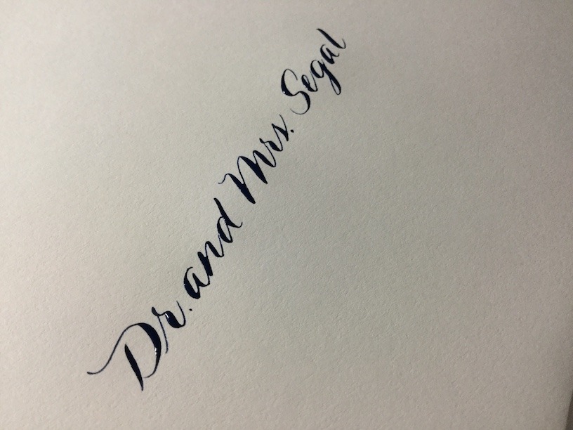
And finally, I can begin to address those envelopes.
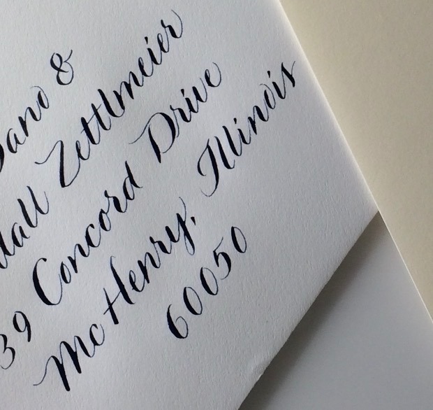
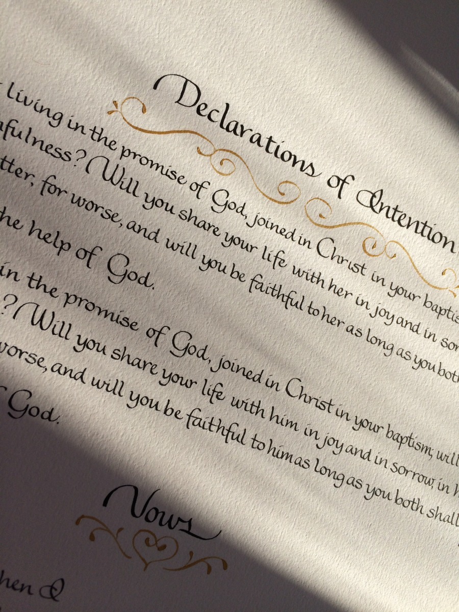
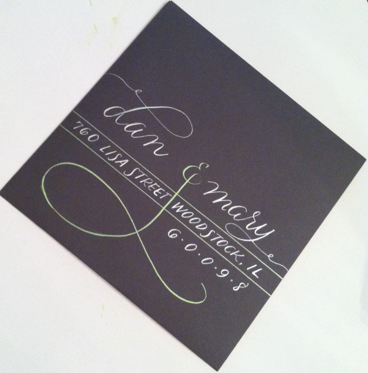
This was a fun lettering style! I'm glad I had the chance to spread my wings a little and give this one a go! If you are interested in this one, it is a hand, pen-lettered script designed to coordinate with the brush script Spring LP.
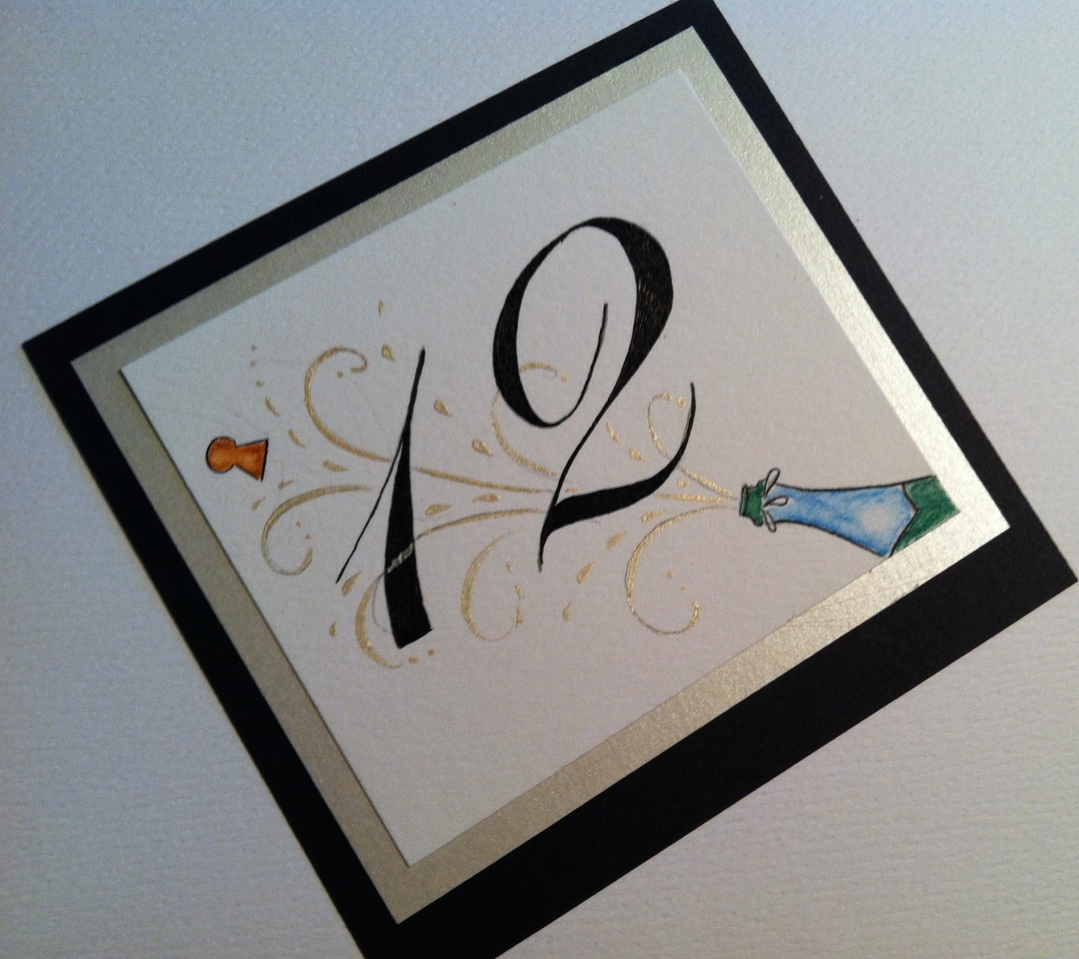
As seen in this post from Style Me Pretty, metallics continue to be popular! And why not? A bit of glitter and sparkle has a way of creating sophistication and excitement. I don't think this trend is going anywhere soon!
From bright, yellow gold to antique gold, from platinum to copper to bronze, I've got the metallic ink to make your calligraphy pop!
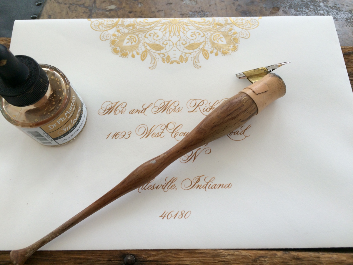
Antique Gold
Yellow Gold
Yellow Gold
Iridescent Green
Watercolors with Gold Embellishment
Platinum
I'm all of a flutter! Early in April, a film crew will be descending on my studio to film a short informational video for my website. One of the crew is a guy I know very well, indeed--my son Sam.

Sam will be graduating from Tribeca Flashpoint College in May and I am fortunate to be the subject of one of his class projects.
I admit I am camera shy--I avoid having my picture taken at all costs--but this is an opportunity that is too good to pass up!
We're in the planning stage right now so I'm reaching out to you, my brides and friends, to hear what YOU would like to see in an informational video. I've got some ideas of my own, but I'd love to hear from you!
The comment section is open! Let me know if you have any ideas and by all means, check out the TFC website!
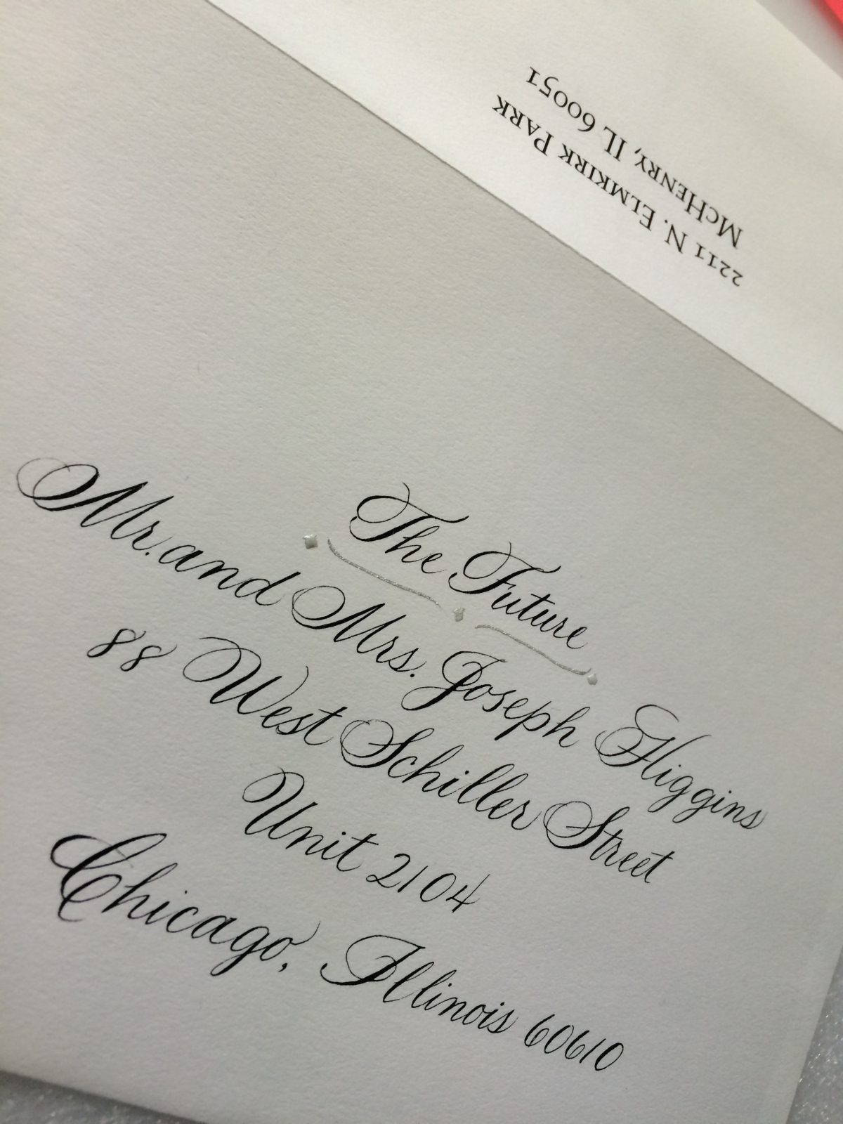
The Knot has rounded up some trendy invitation motifs in their article, Ways to Embellish your Wedding Invitations. I've been working with a very fun bride who has embraced 'Go Bold' in a big way!
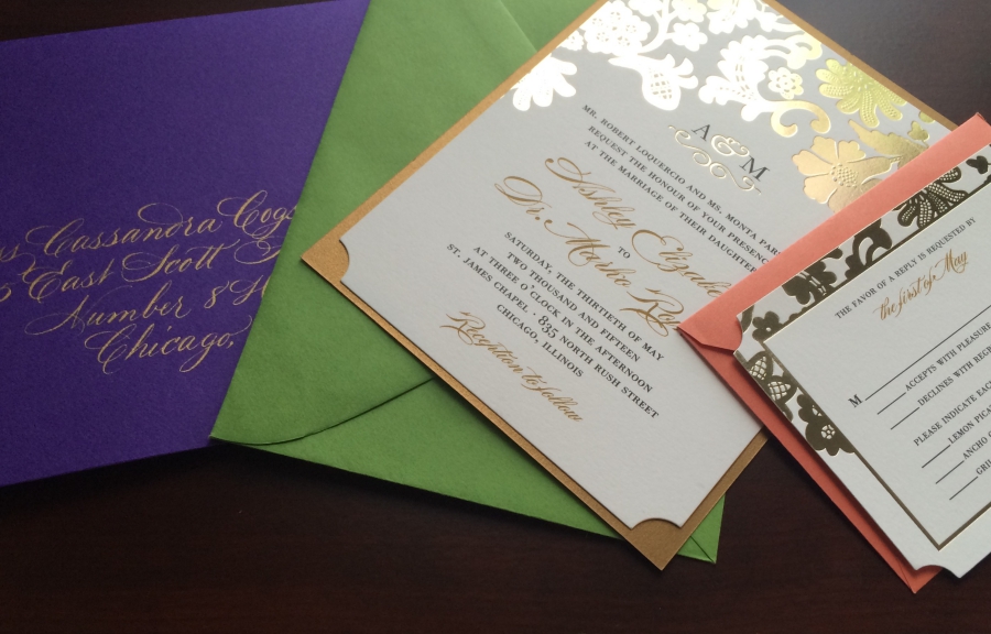
Mary prefered a very traditional approach to her invitations, but I helped her come up with a subtle way to incorporate her silver sequins motif to make her invitations POP!

"Go Bold or Go Home" or "Less is More"? It's all in your hands! Let me help you introduce your style to your guests with the perfectly addressed envelope!
 Kim
Kim