The Constant Scribe

Friday
Apr212017

The Scriptorium is my work journal; a place for show and tell.
Choosing your color palatte can be a daunting task. With all the beautiful visual inspiration available on wedding sites and Pinterest, it is easy to become over stimulated, confused, and left with the feeling of wanting to have it all.
Here is a great article from the Knot, 13 Top Wedding Color and Style Mistakes not to Make, that will help guide you past some of the pitfalls that may be lurking out there as you plan the palatte for your wedding day.
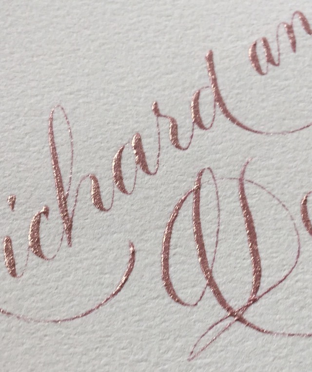
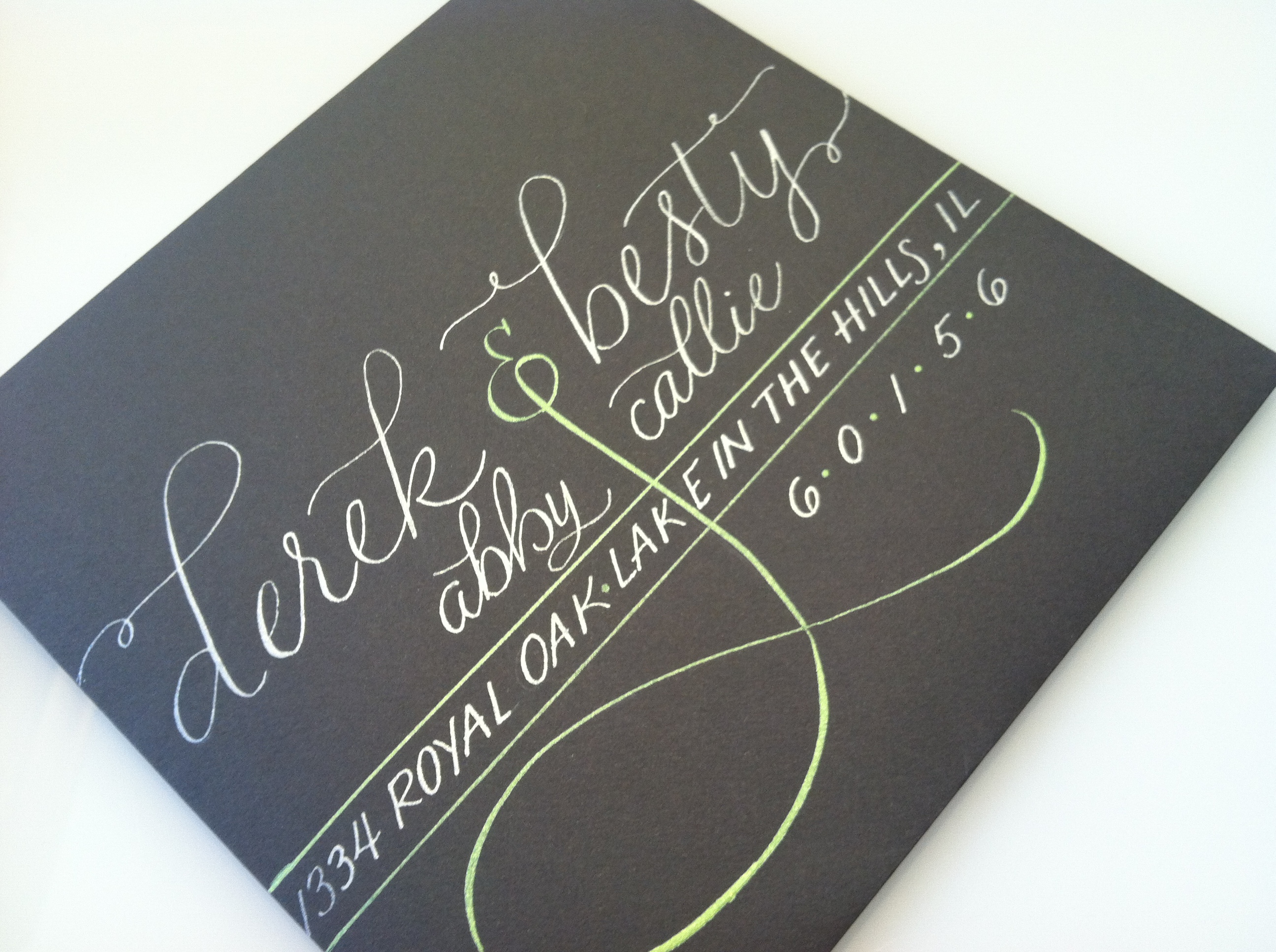
As your calligrapher, I found #8 to be particularly helpful: Not Coordinating Your Paper Elements--The Fix: Include Your Colors in Your Invitation Suite.
From the Article:
"Your invitations set the stage for the event, so let them introduce your wedding colors and evoke the right tone from the start. Coordinating the invitation colors with those of the wedding can be as easy as choosing a colored font, ribbon or monogram, or as elaborate as layering colored paper. Most importantly: Don’t sacrifice readability for style. That means the type should contrast with the paper, so balance brighter shades with neutrals and avoid light-colored fonts. Bold ink hues like navy and fuchsia work well, and ask your designer about typeface techniques like letterpress or foiling to make your font stand out. Also, consider that invites are a dress code cue for your guests. You wouldn't send out formal ivory cards with black calligraphy unless you're expecting guests to dress black tie for your wedding."
While black ink continues to be the classic, traditional choice for formal weddings, if you have selected a casual, colorful, or whimsical invitation, why not carry that forward to the front of your envelope? Taking the time to plan your invitation suite--right down to the perfect font, ink, and stamp--can really make your invitation pop!
I can help you with that! Let's talk!
Last night I dreamed that I was making ink from dandelion roots. Yes. Dandelion roots. I was boiling them in a cauldren out of doors, like I imagine people would do when making walnut ink, and then I strained it and bottled it in old pop bottles. I sat at a picnic table in the sunshine and wrote with it--the paper was creamy and the 'ink' was green-yellow-brown. I could not see the words but I could see the ink laying down on the paper.
Then I awoke to snow on the ground, a black and red formal piece waiting for me on my drawing board, and no dandelion ink.
I feel bereft somehow.
 Note to Self, creativity, ink
 Of all my most favorite-est things, walnut ink is one of my most favorite-est! I love the warm, rich color, the fine hairlines, the waterbased ease of clean up; the way it lays down on paper. I am partial to earth tones and walnut ink is the most lovely brown earthy color.
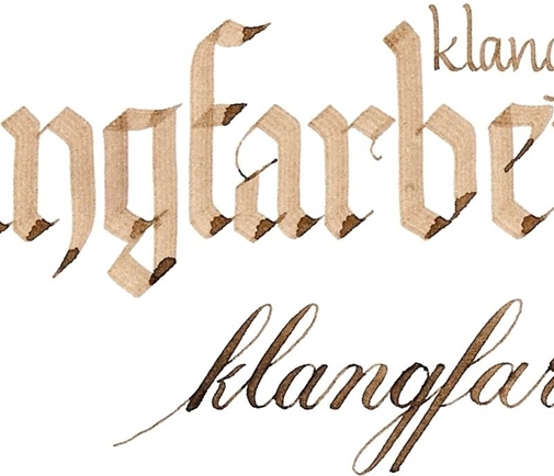
Last year, I participated in a weekly challenge on WetCanvas. When it was my turn to challenge the group, I chose a list of musical terminology. We were to choose a word or words to interpret. I did several, but my favorite was:
Klangfarbenmelodie (Ger): "tone-color-melody", distribution of pitch or melody among instruments, varying timbre
I rendered it in walnut ink because I knew that walnut ink has varied properties depending upon what kind of nib is used to lay it down. The ink is distributed in a variety of ways, but in the same 'tone-color-melody among instruments':
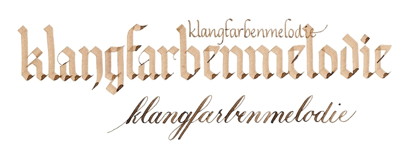 The large gothic hand was laid down using a 3.8 Pilot parallel pen, the copperplate script with a Brause 66 EF pointed nib and the upright italic using a Osmiroid fine nib dipped in walnut ink.
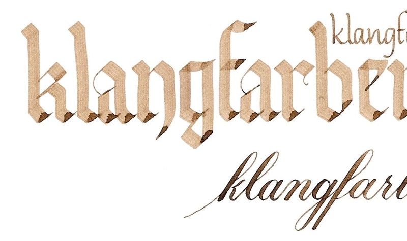
Here's a close up:
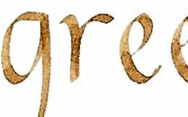
The image above is an extreme clost up so you can see how the walnut ink gathers along the edge of the stroke. So pretty.
Here's one more done in walnut ink for the same challenge:
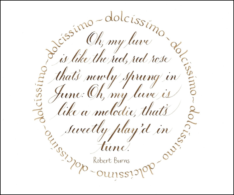
dolcissimo: very sweetly
I frequently use walnut ink for preparatory lettering because it is so easy to clean up.
My Favorite Things, Quotes, creativity, ink, playing around I can't wait! I'm getting a paper shipment from John Neal soon. Hopefully, tomorrow!
I can never decide whether I love new paper or new nibs more. Or new ink.
I think I love paper best. Unless it ink. Or nibs.
What about you? What is your favorite?
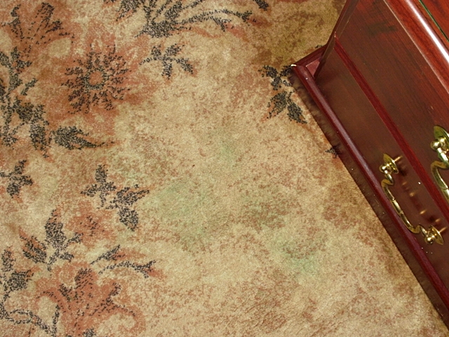
![]() . . . many gallons of water, two bottles of windex, and 4or 5 rolls of paper towel later. . .
. . . many gallons of water, two bottles of windex, and 4or 5 rolls of paper towel later. . .
A CAUTIONARY TALE
So this morning I reached for a new, fresh bottle of Liquitex acrylic ink and, OH! NO!--the lid came off in my hand, the bottle fell from the drawing board and onto the carpet.
How could I allow such a dumb thing to happen, you ask?
Laziness.
I wanted to test the new color against the greens I already had. What I SHOULD have done is put a dropper-ful into a dappen dish, dip the pen, make a couple of lines, then suck the rest of the ink back up in the dropper and clean the pen and dappen dish. Instead, thinking to avoid cleaning the dappen dish (I mean really--how hard is it to clean a dappen dish??) I held the nib over the bottle and touched the end of the dropper to the nib, put the lid on top of the bottle, made my marks, cleaned my pen and promptly forgot about screwing the lid down tight.
Sigh. . .accidents happen. I can usually just roll with a true accident but this? I was SO MAD at myself.
Here's what's left of the stain:
Now I've got a least an hour's worth of work to put my studio back together (everything had to be taken off the top of the desk and the lighted drawing board disassembled because ink got all over it and underneath the glass).
The good news? None of my work was touched. Not a drip or a drop.
So, who else has spilled copious amounts of ink onto carpet? How did you get the stain out? (Or DID you ever get the stain out?)