The Scriptorium is my work journal; a place for show and tell.

Entries in creativity (13)

Monday
Aug032020

A New Journey

Wow!  It's hard to believe it's been so long since I've updated my blog, Scriptorium.  Up until the time COVID-19 hit the scene back in March, it was because I was so busy in my studio that I barely had time to think, let alone compose a blog post!  An occasional post on Instagram was about the extent of my social media involvement.

Like everyone else in America and around the world, life has changed!  Jobs have been few and far between.  You would think that with all that free time, I would have been busily and creatively exploring and learning in the studio, but no.  I've been doing dull chores; cleaning my house, sorting through my basement and attic, and the only creative thing I've done is learn to bake sourdough bread.  

Today my plan is to go into my poor, neglected studio and get cracking.  A thorough cleaning first, then a complete reorganization.  I'm hoping that will inspire me to get back to work!

Keep an eye on this space!


Thursday
Apr202017

Place cards with style


Monday
Jun012015

Eye Catching and Elegant

custom calligraphy Chicago

A special lettering design for a special couple.  Eye catching and elegant.  

Monday
May182015

Top 13 Wedding Color Mistakes

Choosing your color palatte can be a daunting task.  With all the beautiful visual inspiration available on wedding sites and Pinterest, it is easy to become over stimulated, confused, and left with the feeling of wanting to have it all.

Here is a great article from the Knot, 13 Top Wedding Color and Style Mistakes not to Make, that will help guide you past some of the pitfalls that may be lurking out there as you plan the palatte for your wedding day.

As your calligrapher, I found #8 to be particularly helpful:  Not Coordinating Your Paper Elements--The Fix:  Include Your Colors in Your Invitation Suite.

From the Article:

"Your invitations set the stage for the event, so let them introduce your wedding colors and evoke the right tone from the start. Coordinating the invitation colors with those of the wedding can be as easy as choosing a colored font, ribbon or monogram, or as elaborate as layering colored paper. Most importantly: Don’t sacrifice readability for style. That means the type should contrast with the paper, so balance brighter shades with neutrals and avoid light-colored fonts. Bold ink hues like navy and fuchsia work well, and ask your designer about typeface techniques like letterpress or foiling to make your font stand out. Also, consider that invites are a dress code cue for your guests. You wouldn't send out formal ivory cards with black calligraphy unless you're expecting guests to dress black tie for your wedding."

While black ink continues to be the classic, traditional choice for formal weddings, if you have selected a casual, colorful, or whimsical invitation, why not carry that forward to the front of your envelope?  Taking the time to plan your invitation suite--right down to the perfect font, ink, and stamp--can really make your invitation pop!

I can help you with that!  Let's talk!

Whimsical Wedding Envelope Design


Friday
May152015

Calligraphy is not just for Weddings!

Chicago Calligrapher Birth Announcement

This is my little granddaughter, Annie's, birth announcement.  But change the information and it could be a Wedding Shower invitation, a Rehearsal Dinner invitation, a special note for a special guest.  Chose your colors, lettering style, and motif; from design to print to envelope addressing, your stationary ideas are brought to life through The Constant Scribe!

Wednesday
Jan092013

Second Downton Quote, Season 3 Episode 1

Downton Abbey QuoteSir Anthony Strallan to Lady Edith Crawley

Season 3 Episode 1


Monday
Apr182011

I dream of writing

Last night I dreamed that I was making ink from dandelion roots.  Yes.  Dandelion roots.  I was boiling them in a cauldren out of doors, like I imagine people would do when making walnut ink, and then I strained it and bottled it in old pop bottles.  I sat at a picnic table in the sunshine and wrote with it--the paper was creamy and the 'ink' was green-yellow-brown.  I could not see the words but I could see the ink laying down on the paper.

Then I awoke to snow on the ground, a black and red formal piece waiting for me on my drawing board, and no dandelion ink. 

I feel bereft somehow.

Wednesday
Sep012010

My Favorite Things: Walnut Ink

Of all my most favorite-est things, walnut ink is one of my most favorite-est!  I love the warm, rich color, the fine hairlines, the waterbased ease of clean up; the way it lays down on paper.  I am partial to earth tones and walnut ink is the most lovely brown earthy color.

Last year, I participated in a weekly challenge on WetCanvas.  When it was my turn to challenge the group, I chose a list of musical terminology.  We were to choose a word or words to interpret.  I did several, but my favorite was:

Klangfarbenmelodie (Ger): "tone-color-melody", distribution of pitch or melody among instruments, varying timbre

I rendered it in walnut ink because I knew that walnut ink has varied properties depending upon what kind of nib is used to lay it down.  The ink is distributed in a variety of ways, but in the same 'tone-color-melody among instruments':

Walnut Ink CalligraphyThe large gothic hand was laid down using a 3.8 Pilot parallel pen, the copperplate script with a Brause 66 EF pointed nib and the upright italic using a Osmiroid fine nib dipped in walnut ink.

Walnut Ink Calligraphy

Here's a close up:

Walnut Ink Calligraphy

The image above is an extreme clost up so you can see how the walnut ink gathers along the edge of the stroke.  So pretty.

Here's one more done in walnut ink for the same challenge:

dolcissimo: very sweetly

I frequently use walnut ink for preparatory lettering because it is so easy to clean up. 

Tuesday
Aug102010

Quote: Albrecht Durer

`How often do I see great art in my sleep, but on waking cannot recall it; as soon as I awake, my memory forgets it.'   Albrecht Durer

Me?  I see a great join with an ampersand when I'm in the shower but I by the time I'm dressed and back to my drawing board, my memory forgets it. . .


I've been trying to incorporate a heart shaped ampersand into the heading of a seating chart and even though I did 'see' it, it still eludes me.


Sigh. . .

Friday
Aug062010

Homemade Portable Light Box

Necessity, they say, is the mother of invention.

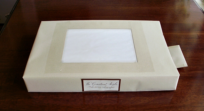
Many, many years ago I made this light box out of an old shirt box out of necessity.  I had promised to scribe some bookmarks at a church Family Fun Fair but my lighted drawing board was too big and bulky to take along. My little box wasn't very attractive (I think it said Kohl's across the top) but it worked great.  I've used it off and on and it's proven to be pretty sturdy.

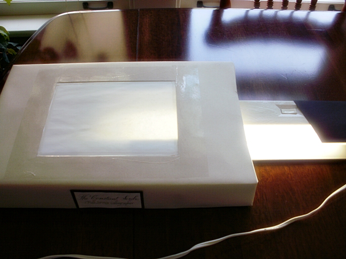
Last spring, I wanted to use it at a Bridal Fair, but it looked pretty beat up, so I covered it with paper and slapped a logo on the front.

In hind sight, I wish I had taken photos of it before I covered it but hopefully, with the photos, you'll be able to see how I did it and maybe make one for yourself!

To get started you'll need a standard shirt box, an 8 x 10" piece of glass, duct tape, scissors, exacto knife, a ruler, and an 18" under-the-counter fluorescent light fixture.

Working with the top box lid facing down, draw diagonal lines from corner to corner on the inside of the box lid to find the center.  Using those lines as a guide, lay the glass down on the inside of the box top, center it, and trace around it.  Set the glass aside.  Now, using the ruler, make a rectangle inside the one you just traced, measuring 1/2 inch in on all sides.  Laying the shirt box top on a surface safe to cut on, cut out the inner rectangle using a ruler and exacto knife (or you could use a rolling cutter).  You'll need to cut a piece of translucent paper the same size as your glass and tape it securely to the glass.  Now, lay the glass back down where you centered it, (glass side down, paper side up) and secure with duct tape.  Flip the lid over and using clear tape, tape around the opening, securing the lid to the glass from the outside.


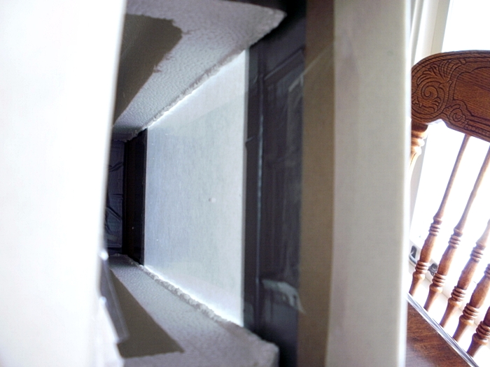
Peeking inside mine, you can see the glass taped to the lid with duct tape.

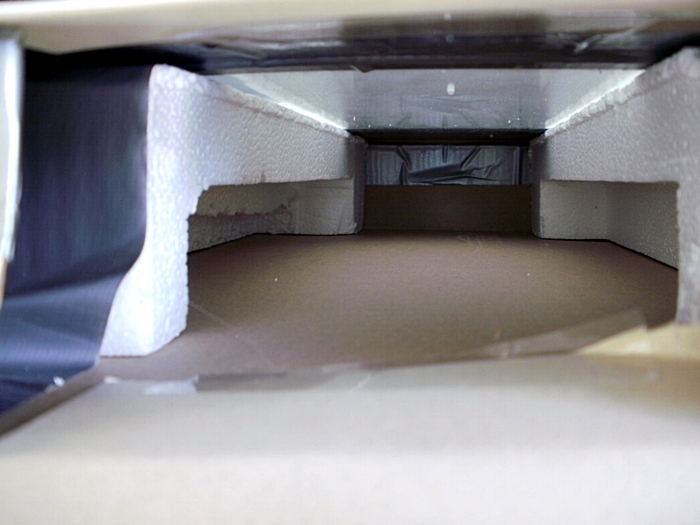
Next, trim some sturdy pieces of styrofoam to run the length of the inside of the box.  If you're lucky, like me, you'll find some that will work without too much trimming.  You'll want them big enough to support the sides of the glass.  Tape them into place securely with duct tape.

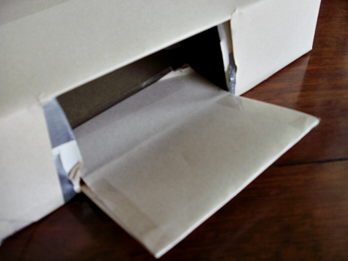
Now, put the lid on top of the bottom and cut a hole in the side all the way through the lid and the side of the box, big enough to slip in your light fixture.  I left a flap but I don't know why.  You don't really need one!  Tape the lid of the box and bottom together.

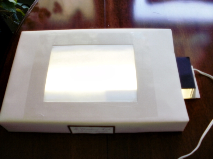
Put your light fixture in the side, plug it in, and you're ready to go!

Clear as mud, right?  If you decide to make one and you have problems or questions, just let me know and I'll try to help!  If you do make one, send me a picture and I'll add it to this post!