The Scriptorium is my work journal; a place for show and tell.

Entries by Kim (169)

Tuesday
Jun092015

Nobody likes surprises. . .

. . .well, nobody likes surprises when they come in the form of hidden fees that can blow your wedding budget to smithereens.

If you are planning your wedding, The Knot has a great article, Watch Out for these 10 Hidden Wedding Costs, that can help you avoid going over budget.

The worst thing about hidden fees is just that, they are hidden. That's why, when brides come to me for a quote, I gather as much information as I can about their job before I make up a quote for them so that I can be as accurate as possible.  There is no 'one size fits all quote' for calligraphy services so my quotes are broken down so that every charge is seen and explained and there are no hidden charges.

I don't like surprises like that and neither do you.  And that is why the client questionnaire I send out is so important and why I take the time to ask the questions to understand the in's and out's of your invitation suite and envelopes.  I don't like to get surprised with opaque envelopes when I was expecting white, a last minute change of mind regarding centered lines of address, or unexpected specialty paper.  These are schedule busters for me that can create a time crunch and budget busters for you when I have to charge more for unexpected or previously unasked for services.

There's an easy way to avoid these budget busters--do business with vendors like me who take the time to ask the right questions, explain their quotes, and provide their policies.  

There are no silly questions so ask a lot of them!  Let's talk!

Monday
Jun082015

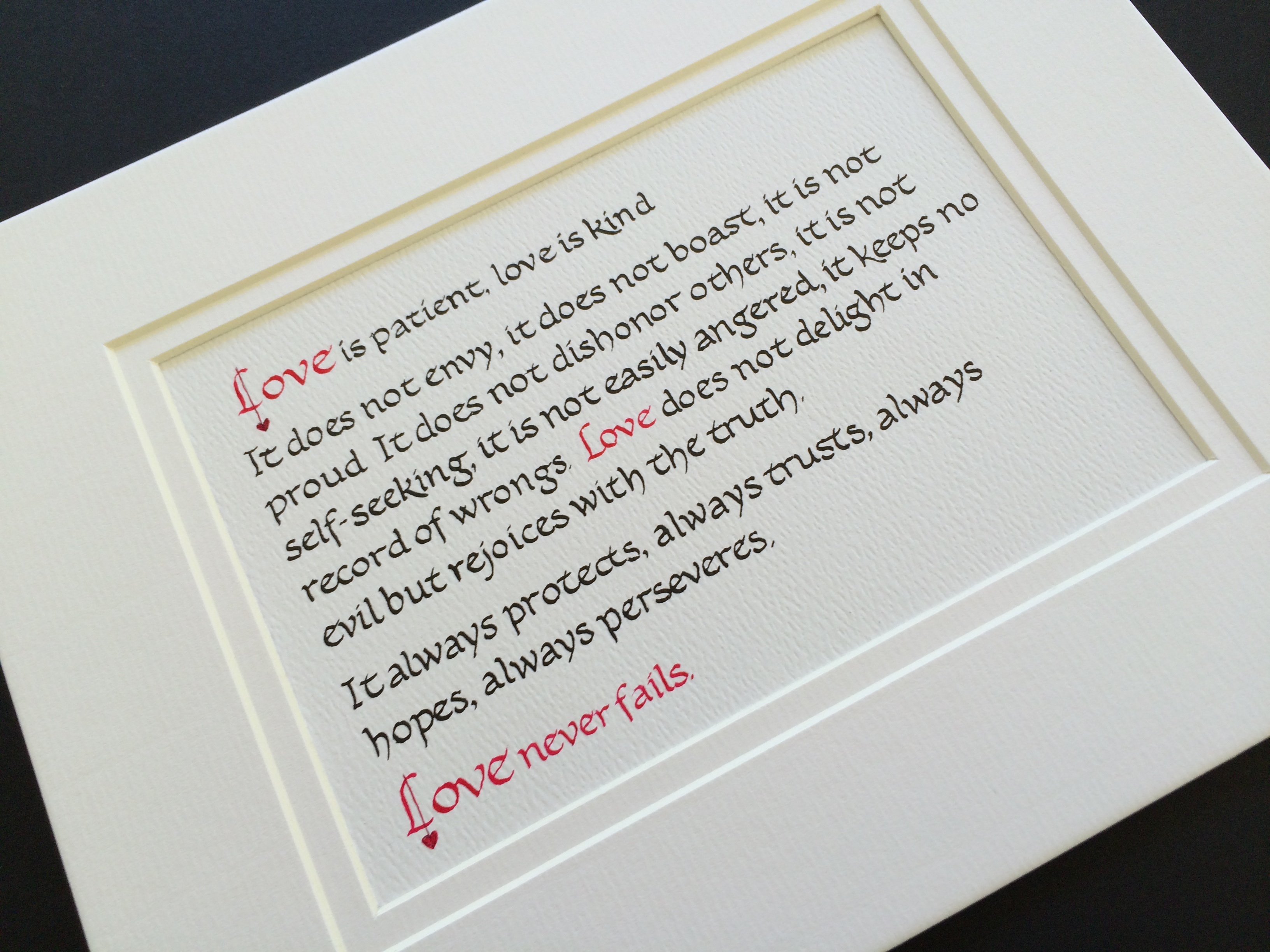
Love is patient. . .

calligraphy 1 Corinthians 13

Monday
Jun012015

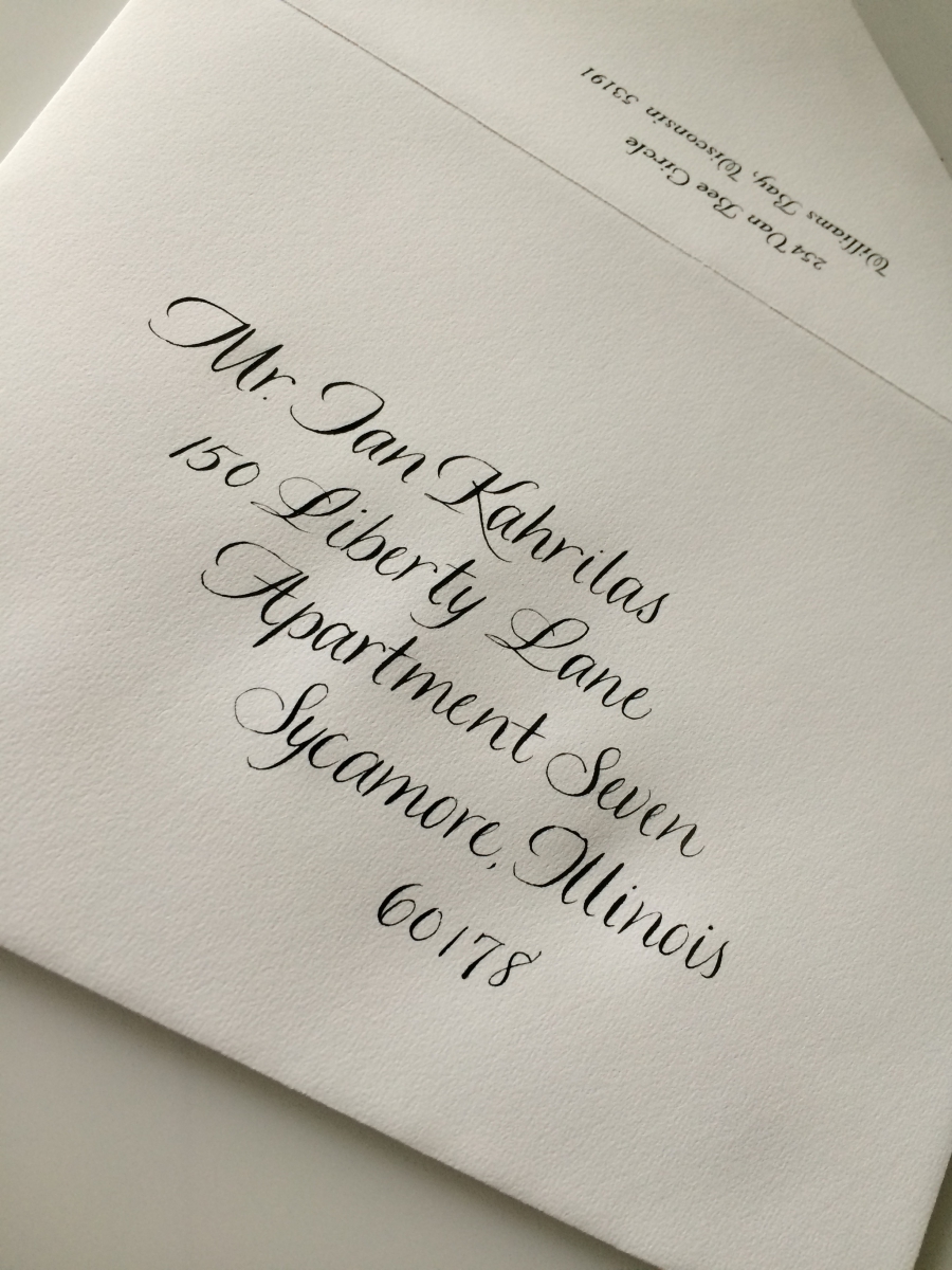
Eye Catching and Elegant

custom calligraphy Chicago

A special lettering design for a special couple.  Eye catching and elegant.  

Saturday
May302015

Getting those lines straight

Here you can see my guide sheet illuminated by my light pad. I create a custom guide sheet for every envelope based on the script I will be using the letter the envelopes.  

When I am lettering opaque or heavily lined envelopes, I cannot use my light pad so I have to lightly mark the guide lines in pencil on each envelope, letter the address, and then when the envelope is completed, dried, and proofed, I must go back and erase the light pencil lines.

And sometimes I have to use chalk lines when the light pencil lines don't show up!


Choosing the right method and the right tools is all in a days work!

Saturday
May302015

Won't back down

A small peek at a first draft of a Tom Petty song.

Saturday
May302015

And now for something a little different. . .

Friday
May292015

Marnie Script

A little italic, a little cursive, a little 'pointed pen'. . . Marnie Script has a clean, modern look.

Tuesday
May262015

Monterey Script

I love this flirty, casual, upright script!  Monterey, or Feel Script, has such a light and cheerful look, don't you think?


Monday
May252015

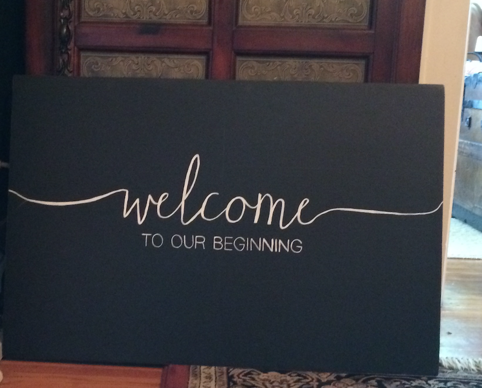
Wedding Welcomes


Monday
May182015

Top 13 Wedding Color Mistakes

Choosing your color palatte can be a daunting task.  With all the beautiful visual inspiration available on wedding sites and Pinterest, it is easy to become over stimulated, confused, and left with the feeling of wanting to have it all.

Here is a great article from the Knot, 13 Top Wedding Color and Style Mistakes not to Make, that will help guide you past some of the pitfalls that may be lurking out there as you plan the palatte for your wedding day.

As your calligrapher, I found #8 to be particularly helpful:  Not Coordinating Your Paper Elements--The Fix:  Include Your Colors in Your Invitation Suite.

From the Article:

"Your invitations set the stage for the event, so let them introduce your wedding colors and evoke the right tone from the start. Coordinating the invitation colors with those of the wedding can be as easy as choosing a colored font, ribbon or monogram, or as elaborate as layering colored paper. Most importantly: Don’t sacrifice readability for style. That means the type should contrast with the paper, so balance brighter shades with neutrals and avoid light-colored fonts. Bold ink hues like navy and fuchsia work well, and ask your designer about typeface techniques like letterpress or foiling to make your font stand out. Also, consider that invites are a dress code cue for your guests. You wouldn't send out formal ivory cards with black calligraphy unless you're expecting guests to dress black tie for your wedding."

While black ink continues to be the classic, traditional choice for formal weddings, if you have selected a casual, colorful, or whimsical invitation, why not carry that forward to the front of your envelope?  Taking the time to plan your invitation suite--right down to the perfect font, ink, and stamp--can really make your invitation pop!

I can help you with that!  Let's talk!

Whimsical Wedding Envelope Design